MATT’S HONEY: PACKAGING/BRANDING DESIGN
Adobe Illustrator
Adobe Photoshop
Adobe InDesign
Adobe Illustrator
Adobe Photoshop
Adobe InDesign
A project aimed to create a visual identity for a honey brand. Character design and a captivating storyline is incorporated to create a welcoming and relatable brand persona. Customers are not only enticed by the promise of delicious honey, but also invited to be a part of the characters’ heartwarming journey, fostering lasting connections and loyalty.
LOGO SKETCHES:

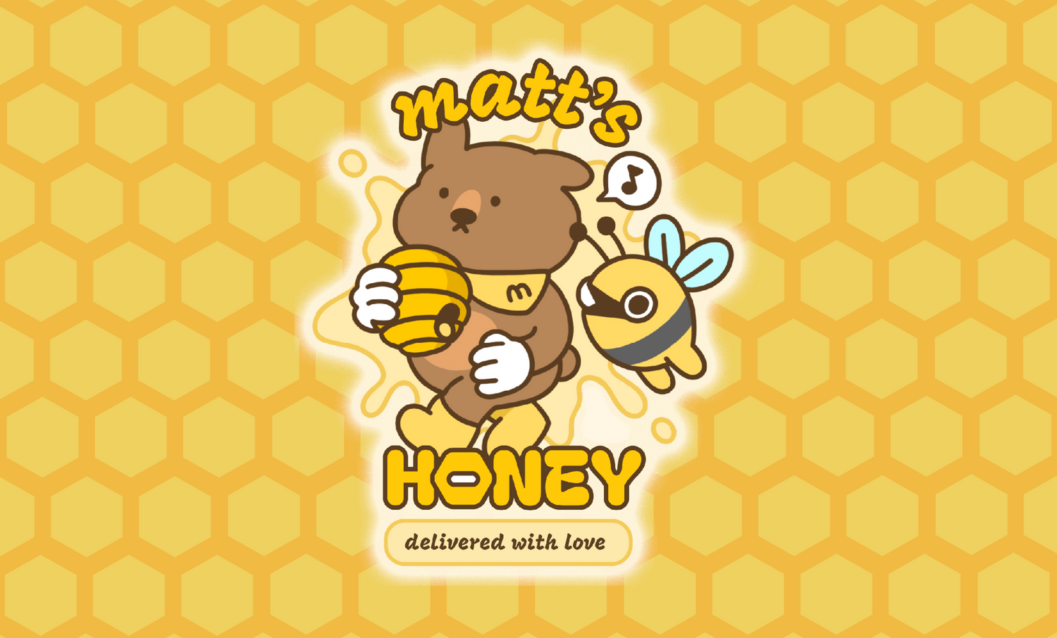
CHARACTER & LOGO DESIGN:


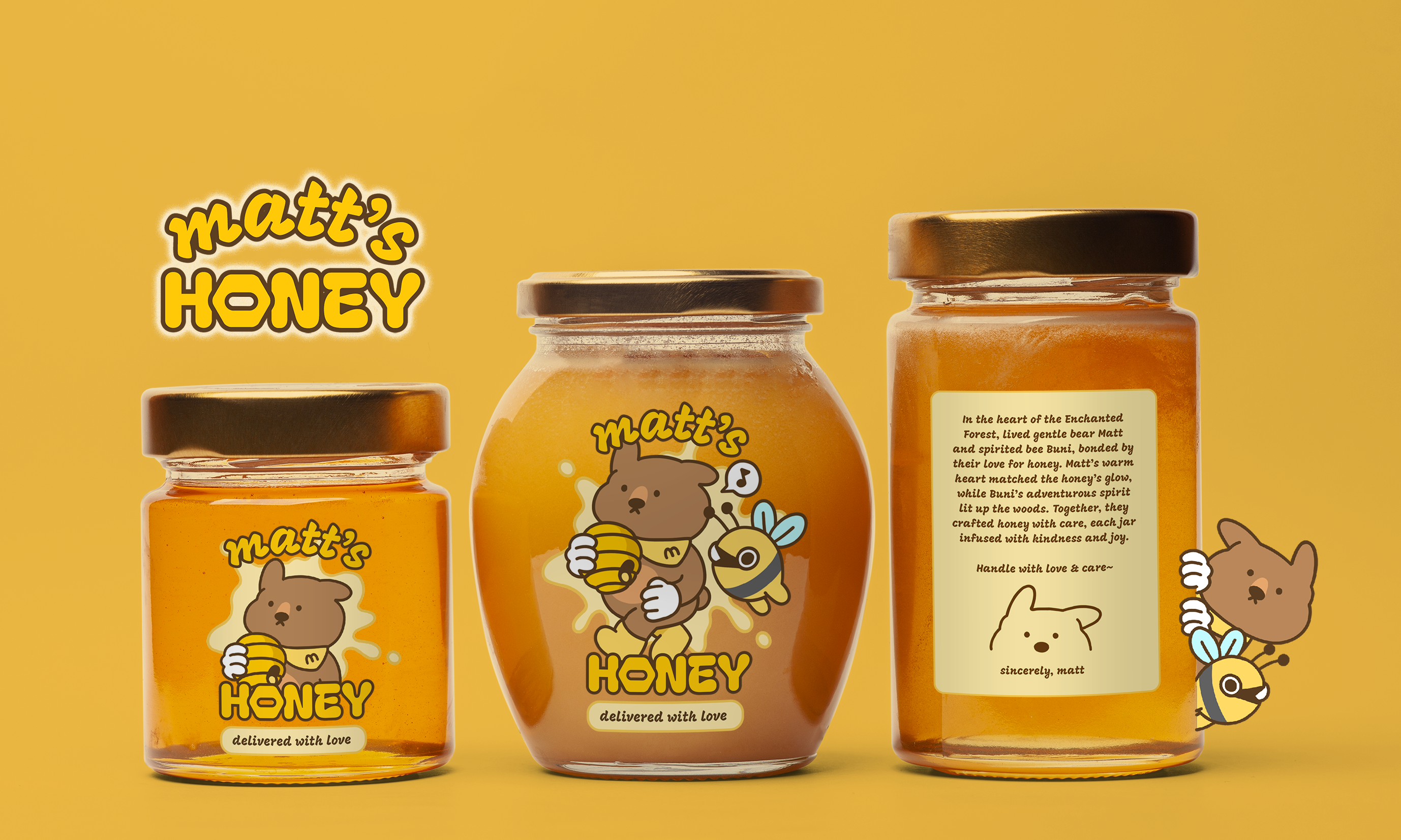
LOGO PLACEMENT:
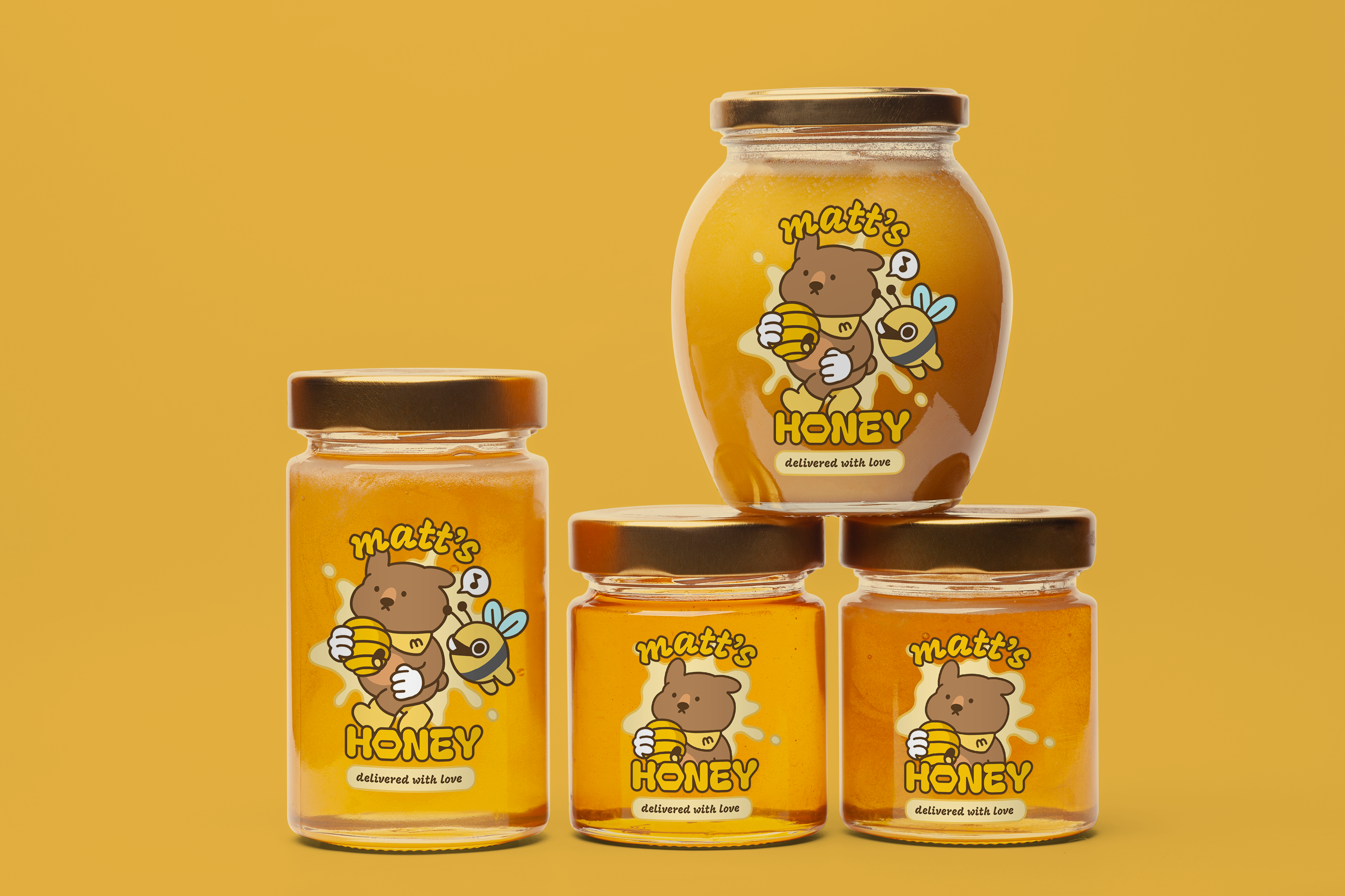
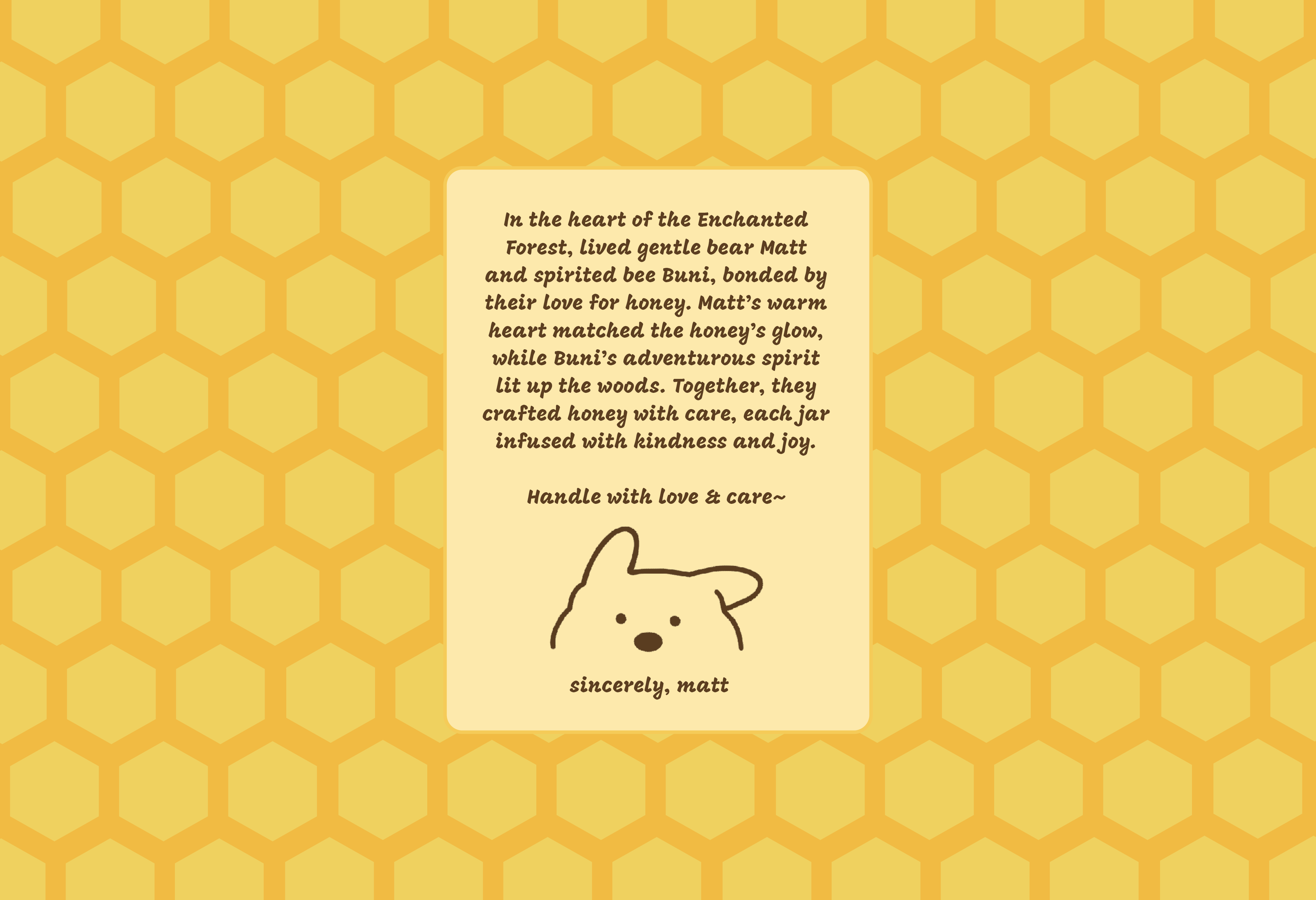
The incorporation of a storyline adds depth to the brand's identity. The narrative follows Matt's and Buni’s journey through diverse landscapes, highlighting the meticulous process of honey-making and the natural goodness of Matt’s Honey.

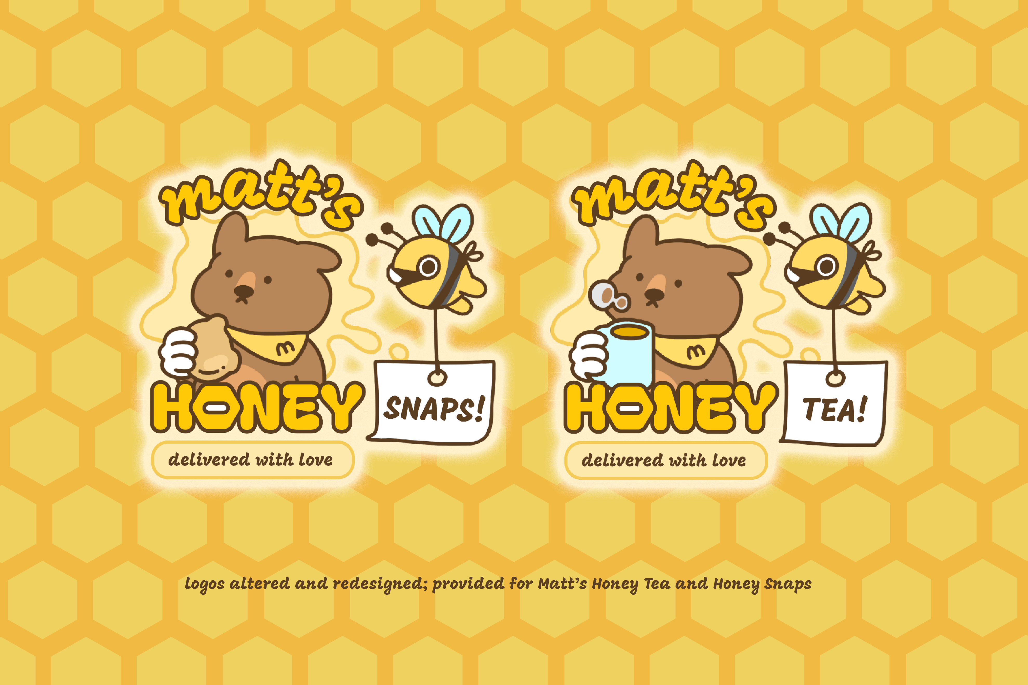
LOGO FOR SUPPORTING PRODUCTS:

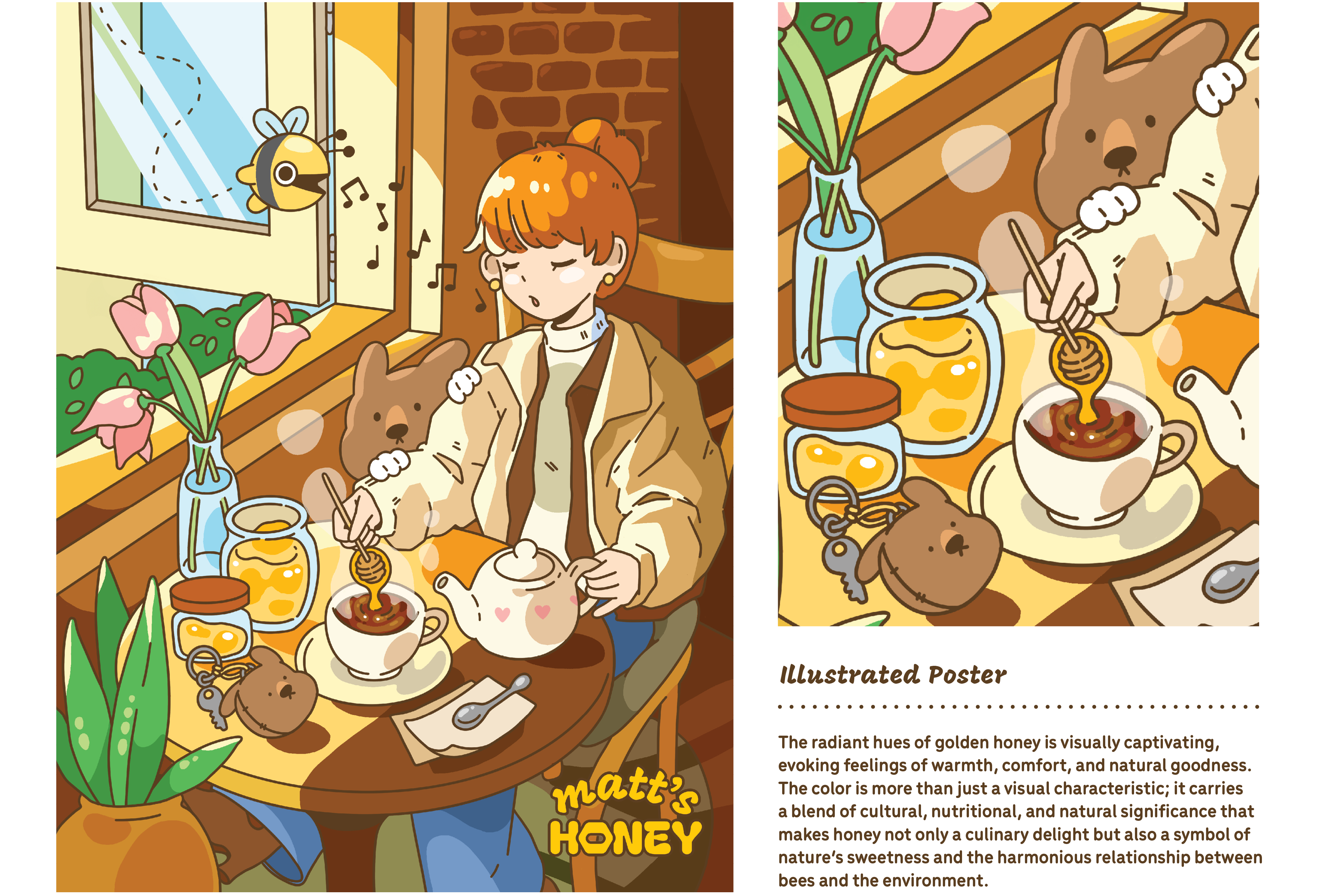
The radiant hues of golden honey is visually captivating, evoking feelings of warmth, comfort, and natural goodness. The color is more than just a visual characteristic; it carries a blend of cultural, nutritional, and natural significance that makes honey not only a culinary delight but also a symbol of nature's sweetness and the harmonious relationship between bees and the environment.
ILLUSTRATED POSTER FOR ADVERTISING:
APPLICATION:

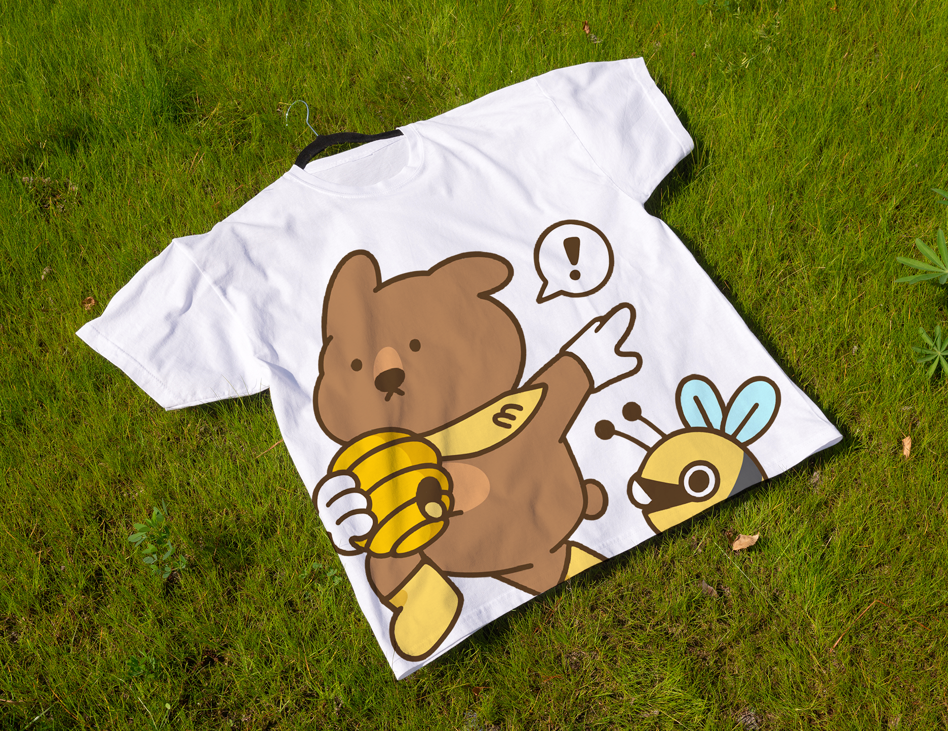

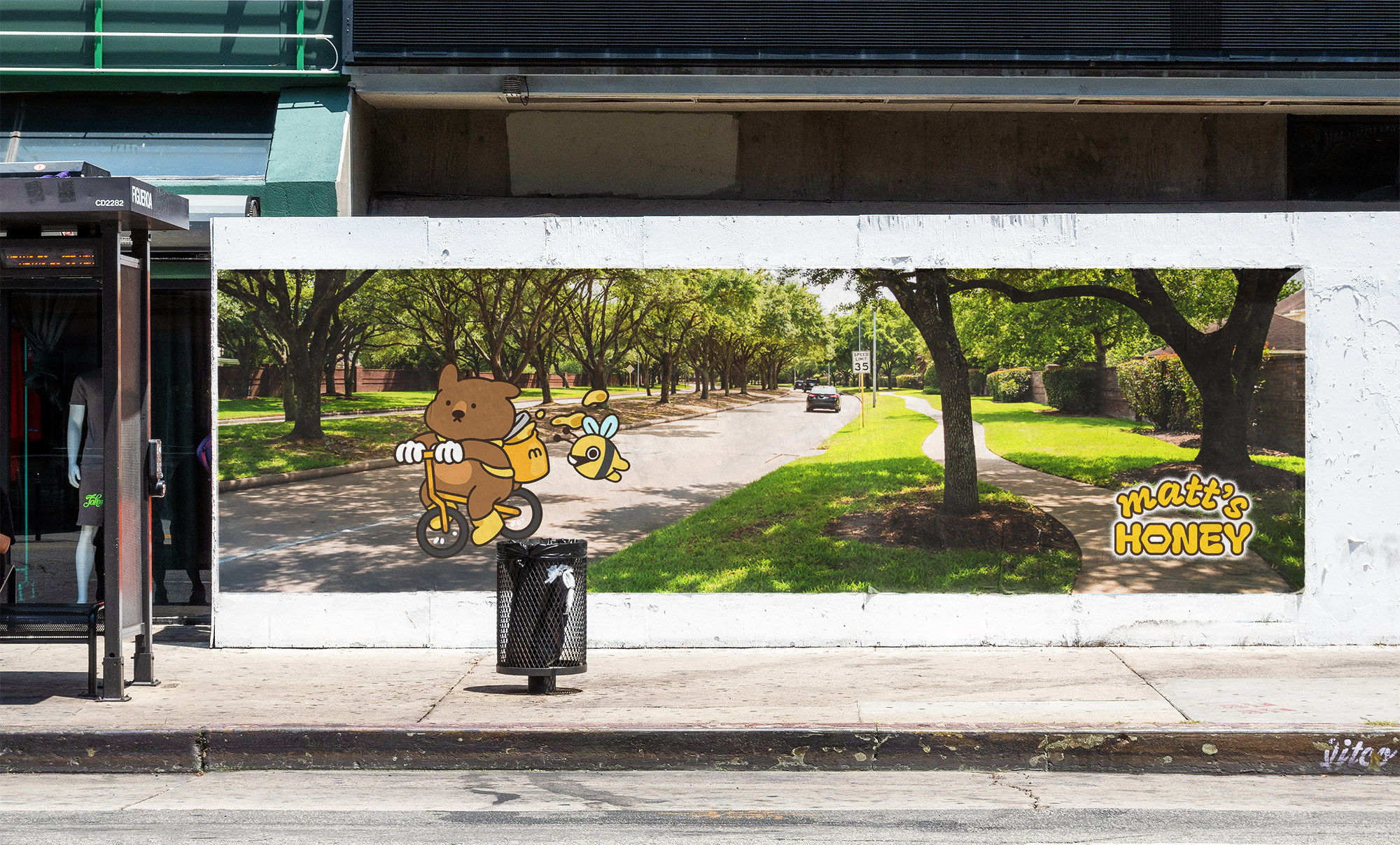
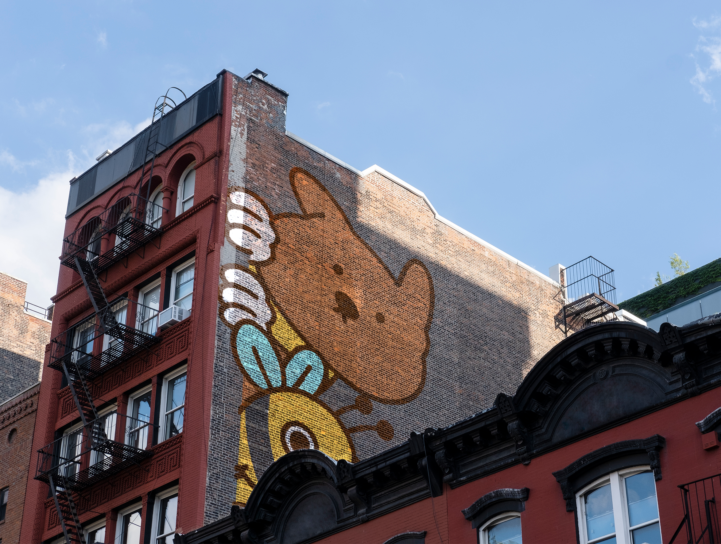
Matt and Buni’s journey of delivering fresh honey around the city~
